Optimizing Schedules with a Drone Delivery App
Drone tracking mobile app with real-time updates and rescheduling feature.
Overview
Role:
UX Designer
Timeline / Year:
6 months / 2021
Tools:
Figma, Notion, Optimal Workshop & Invision
problem
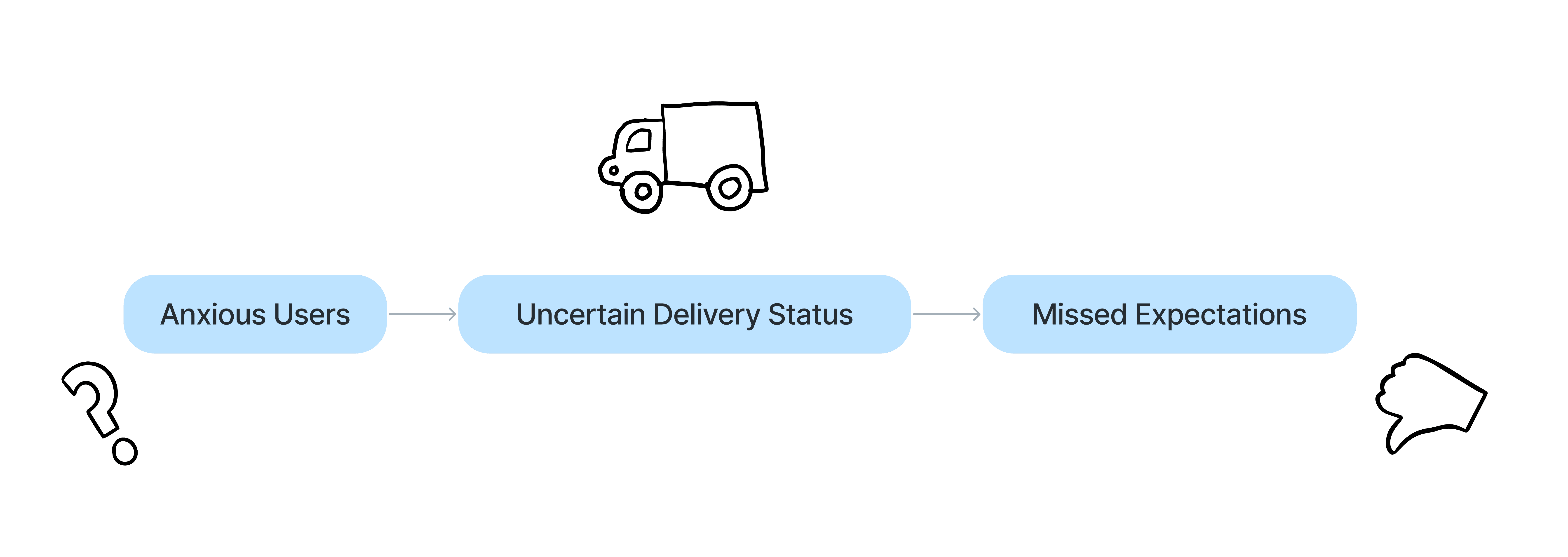
Anxiety in Delivery Experiences
In today’s fast-paced world, the lack of real-time visibility in delivery services leaves users anxious. Last-minute shoppers, like Judy, and small business owners, like Howard, often depend on timely deliveries. Without insight into where their packages are, these users feel frustrated and helpless when delays impact their plans or work schedules.
My mission was to make delivery tracking feel predictable and user-centered by designing a tracking app that gives users control, updates, and peace of mind.
Research & Insights
Understanding the Pain Points
Competitive Audit
During the research phase, I conducted a competitive audit of existing delivery tracking apps to identify market gaps and opportunities among competitors, including indirect competitors such as UPS and FedEx and direct competitors such as Amazon and Walmart.
The competitive analysis, revealed several critical insights:
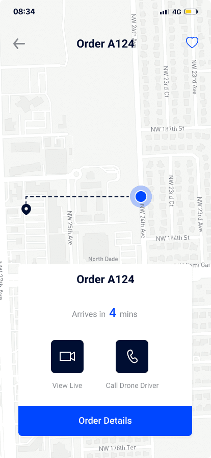
🚚 Lack of real-time tracking
While many apps offered package updates, few provided accurate, real-time tracking of the delivery’s location.
❓ Complexity
Some apps require users to sign up or navigate multiple screens to access basic tracking information, leading to user frustration.
🕑 Limited rescheduling options
Users expressed a desire for more flexibility when rescheduling deliveries, as existing services made this process difficult or buried the option in menus.
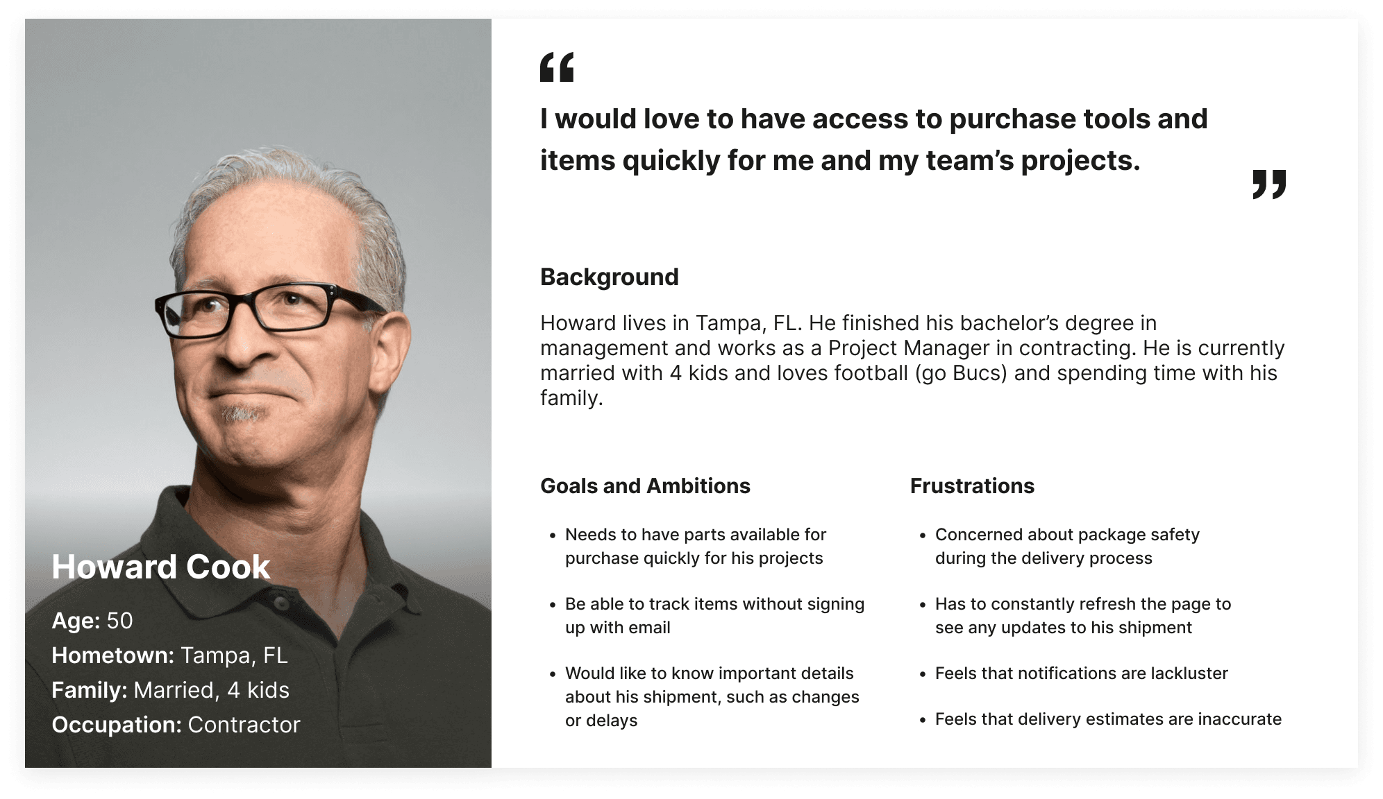
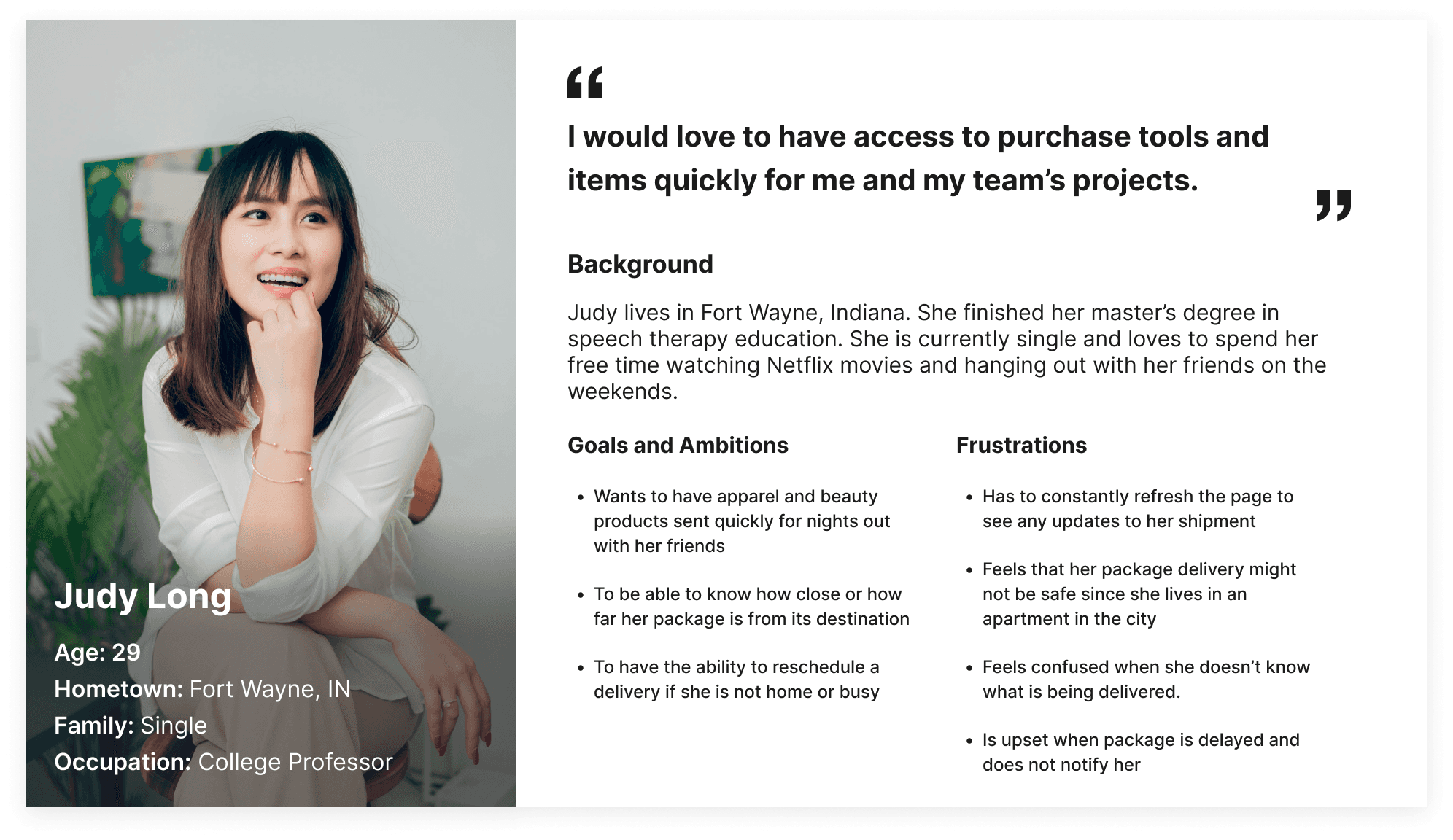
Who Are We Designing For?
I conducted user interviews with six potential users to identify frustrations. Using these insights, I identified two distinct user groups: working adults in manual labor fields needing quick delivery (Howard) and general online shoppers seeking convenience and reliability (Judy).
The primary pain points were unreliable tracking updates, difficulties with rescheduling, and the extra step of signing up for tracking services.
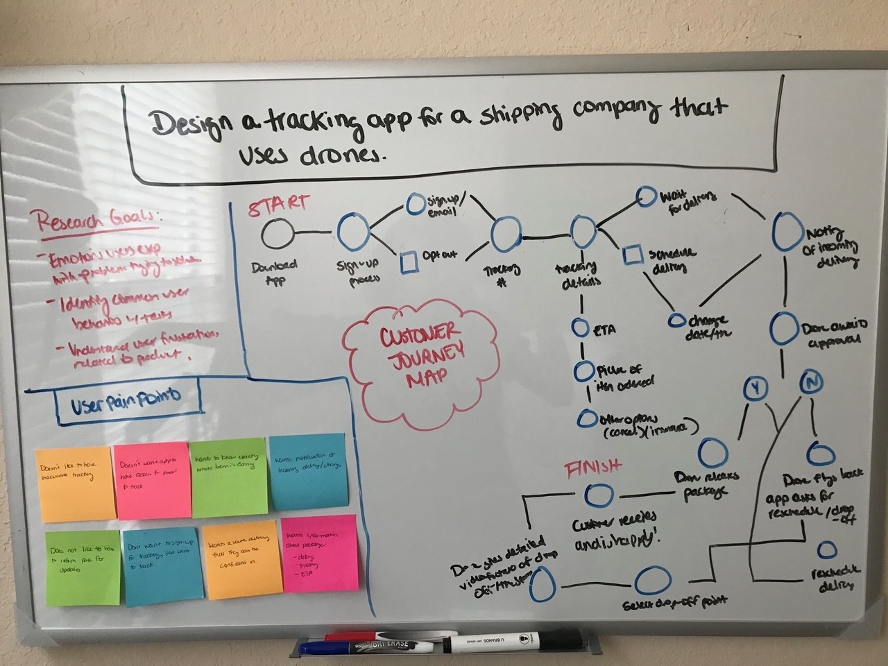
User Journey Map
To further understand the user experience and ensure the Dronal app provided a smooth and efficient tracking process, I developed a User Journey Map for Judy Long, one of the personas identified in my research. This journey map visualizes Judy's interactions with the app, from when she downloads it to when she receives her delivery.
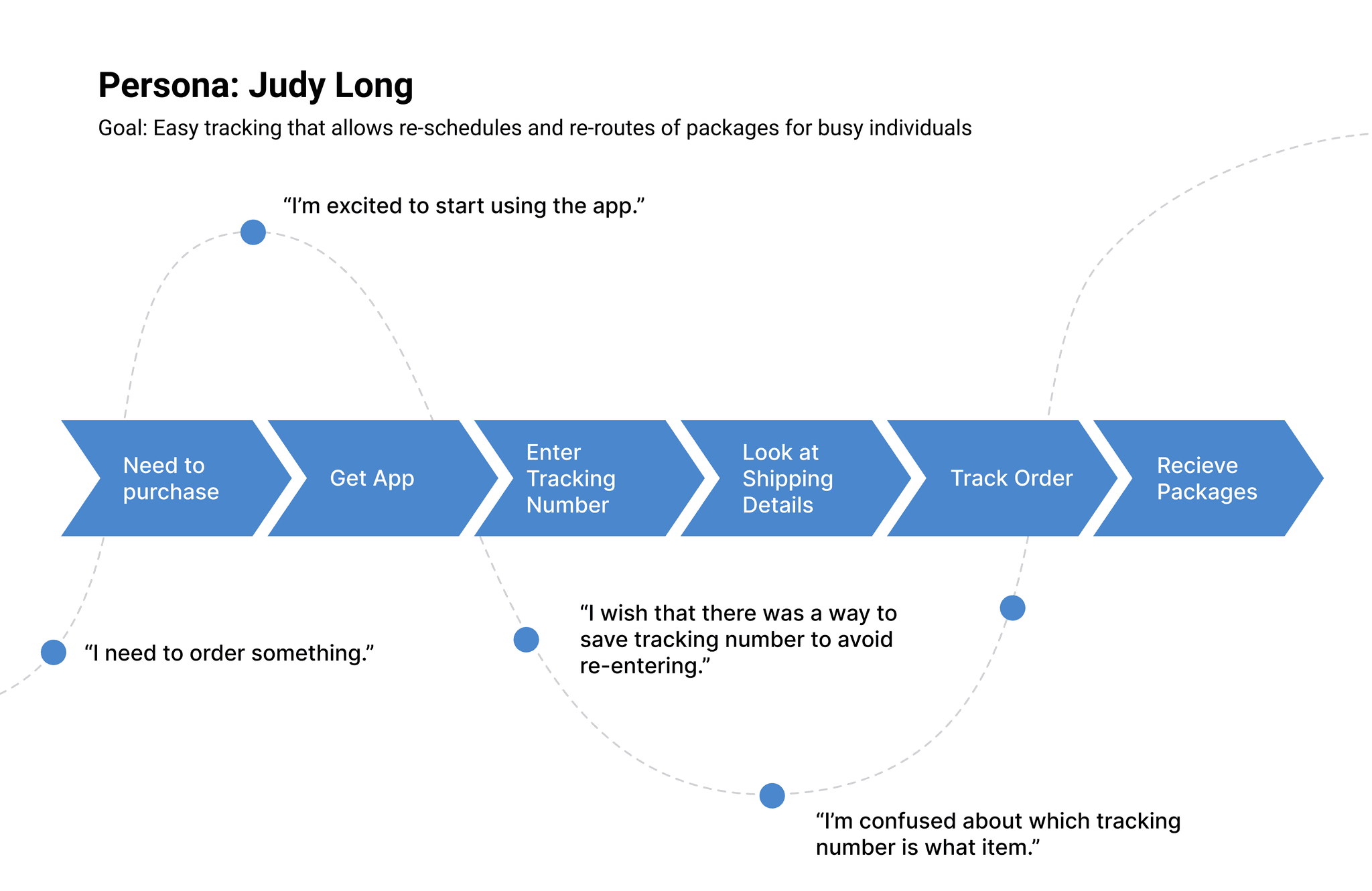
Pain Points:
Inaccurate tracking leaves users guessing.
Complex rescheduling tools waste time.
No live updates disrupt plans.
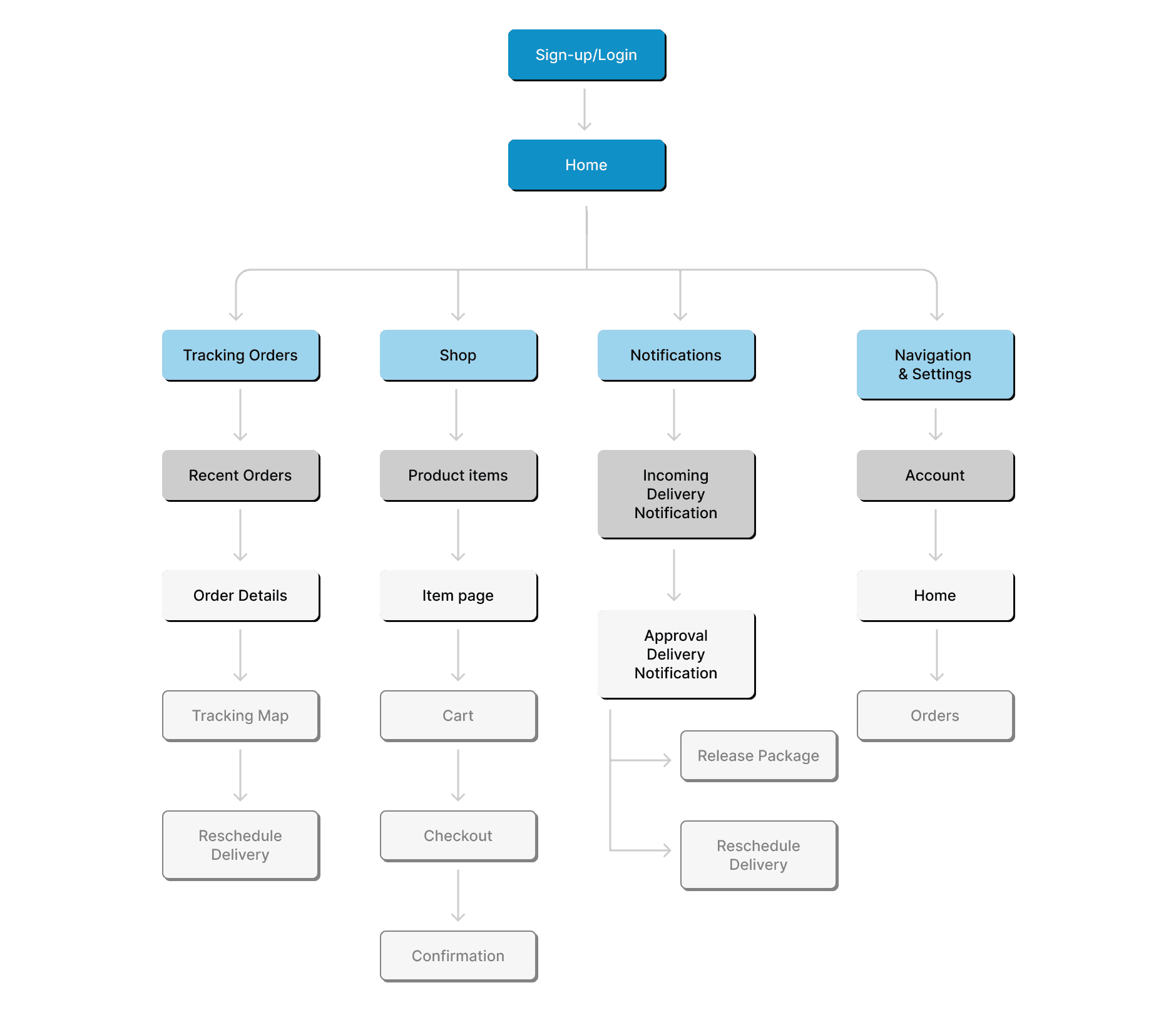
User Flow
To visualize and simplify the app's structure, I designed a User Flow diagram that outlines the key interactions users will go through when navigating the app. This flow ensures that users can quickly access critical features like tracking their packages, managing notifications, and rescheduling deliveries with minimal friction.
design process
From Sketches to Final Prototypes
Sketches
I designed simple sketches of the tracking interface to show all delivery details without requiring a login. The initial designs focused on layout and user interaction, outlining essential functions like homepage navigation, sign-up/log-in, and shopping features.
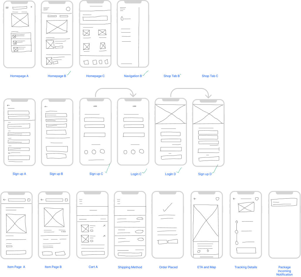
Mid-Fidelity Prototypes
Expanding on the sketches, the mid-fidelity versions incorporated more detailed elements into the user interface based on user feedback. This included adding typography and more defined elements like buttons and input fields, which helped to refine the navigation and functionality, bringing the user interface closer to the final product.
Final Design
A Clean, Intuitive Tracking Solution
The final design offers:
🚚 Real-time updates
📆 Easy rescheduling
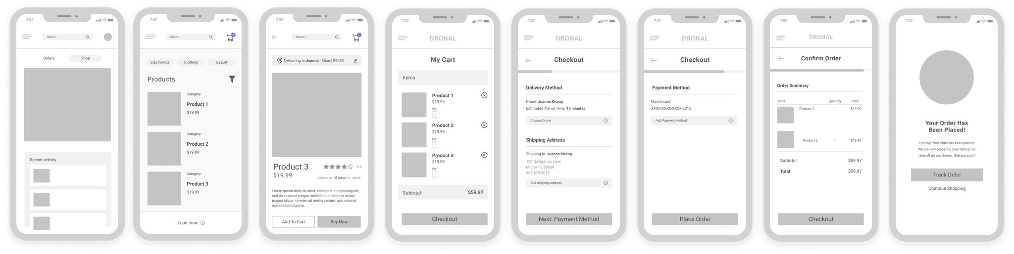
Here are some of the screens I designed:
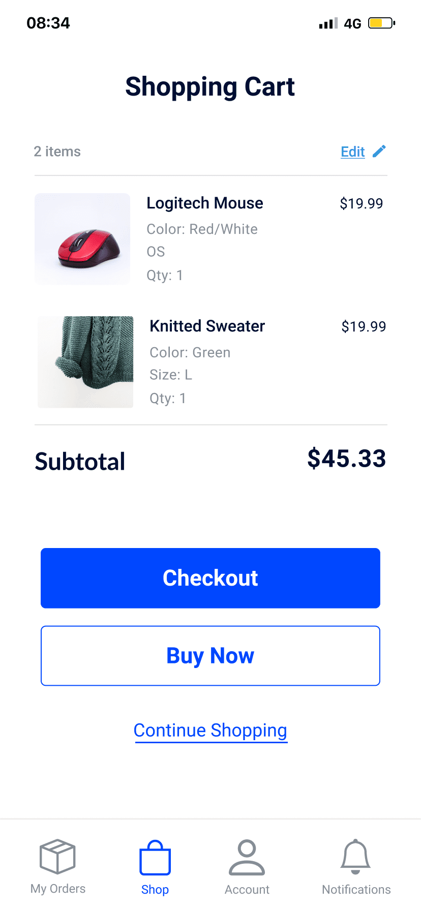
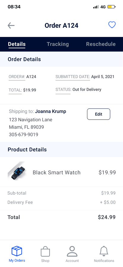
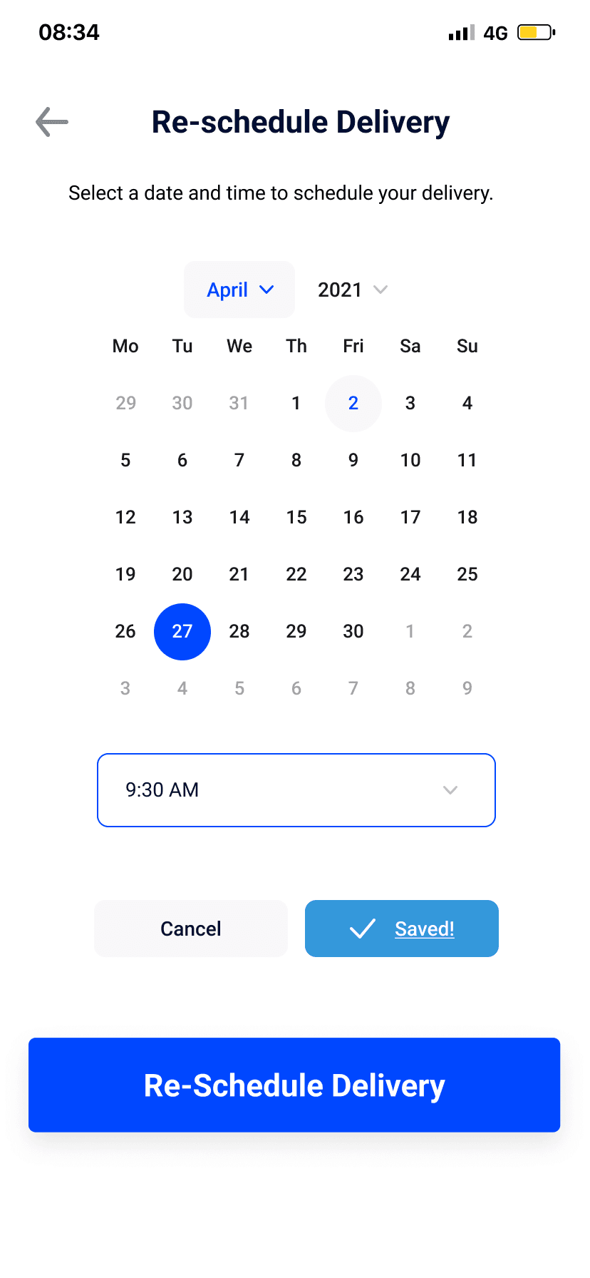
Here is the user's journey from Checkout > Tracking > Rescheduling their order:
constraints
Navigating Design and Technical Constraints
Designing this app was a challenge. Users wanted detailed, real-time tracking information, but too much information could overwhelm them. It was important to keep the interface clean and easy to use while providing enough data to meet user needs.
Developing the live tracking feature was technically challenging due to streaming real-time data, especially with fast-moving drones. This required close collaboration with developers to ensure the feasibility without causing performance issues or app delays.
I focused on essential features like tracking location and delivery time estimates to address these challenges, postponing more complex elements such as live drone video feeds for future updates. This approach allowed the app to remain functional and user-friendly without overly complicating the experience. Developer input was crucial in meeting user needs while maintaining technical feasibility.
reflections
Key Takeaways: Keeping User Focus
This project was one of my first solo endeavors, and I'm proud of the work I accomplished. In hindsight, I realized how easy it is to get caught up in adding new features—like the e-commerce functionality—at the expense of the core user need. My initial focus was on tracking, which was the key concern for users, but I shifted toward additional features that diluted the simplicity of the solution.
This project taught me the importance of prioritizing the user’s emotional journey. Collaborating with developers on the live tracking feature highlighted the need to balance technical feasibility with user needs. I learned to focus on core functionality, ensuring every feature served a meaningful purpose.