Simplifying Speech Therapy Access for Parents
MVP for Connective's online platform, to streamline finding speech therapy services for children.
Overview
In collaboration with a team of 8 UX designers, I contributed to designing an MVP for Connective, a nonprofit dedicated to supporting individuals with intellectual and developmental disabilities (IDD). My focus was on creating a resource guide that simplified access to essential services for parents navigating speech therapy for their children.
By prioritizing user-centered solutions, we aimed to reduce the stress and complexity parents face when seeking support for their children.
problem
Parents’ Struggle to Access Speech Therapy
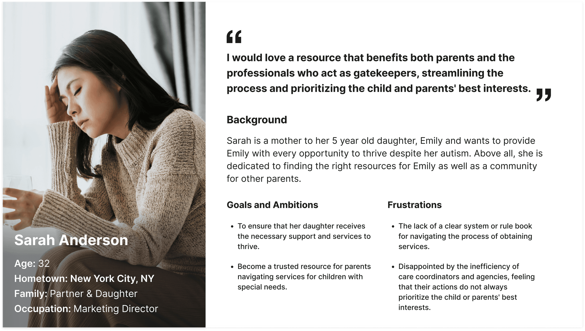
Imagine being a parent of a child with IDD in New York City, desperately seeking speech therapy services but hitting constant roadblocks. This was the reality for Sarah, a devoted mother who shared her harrowing experience with me:

"I've spent countless hours calling clinics, browsing outdated websites, and filling out forms—only to end up feeling more lost than when I started. I just want to help my child, but I don't know where to turn."
— sarah anderson
Sarah's story is one of many. Parents face a labyrinth of outdated information, fragmented resources, and time-consuming processes that leave them feeling frustrated and alone. Our mission set out to transform this daunting journey into a supportive and navigable path, giving parents like Sarah the clarity and control they need to find the best care for their children.
Research & Insights
Challenges Faced by Parents in NYC
To truly empathize with parents' struggles, we conducted extensive user research involving interviews, surveys, and contextual inquiries with numerous families. Our findings crystallized into three primary pain points:
😥 Limited information
Finding comprehensive and up-to-date information on speech therapists in their area is difficult, with many outdated or incomplete resources.
🚫 Lack of centralization
Parents reported frustration over having no single platform that centralizes these services, making it harder to confidently find the right provider.
🕑 Time-consuming search
The process often involves multiple phone calls, emails, and visits, leaving parents feeling overwhelmed and unsupported.

Sarah's Journey
One key persona, Sarah, represented a mother seeking a streamlined and user-friendly way to find a speech therapist for her child with IDD. Throughout the design process, we returned to Sarah's journey to guide our decisions. For example, Sarah's need for clarity drove us to simplify the landing page, ensuring that the primary value proposition (finding therapists) was immediately obvious.
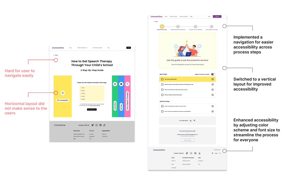
Additionally, Sarah's feedback during early usability testing shaped the resource guide, prompting us to shift from a complex information layout to a simpler checklist format, allowing her to manage her search without feeling overwhelmed.
Design process
From Concepts to Tangible Solutions
Armed with our research insights, we defined clear design objectives to guide our solution:
Design an Engaging and Clear Landing Page: Craft a welcoming landing page that immediately communicates the platform's value proposition and directs users to essential features without overwhelming them.
Develop an Intuitive Search Function: Create a powerful yet easy-to-use search tool enabling parents to filter speech therapists based on location, availability, specialties, languages spoken, and insurance coverage
Create a Centralized Resource Guide: Offer a comprehensive, step-by-step guide presented in a digestible format to help parents navigate the complexities of securing speech therapy services.
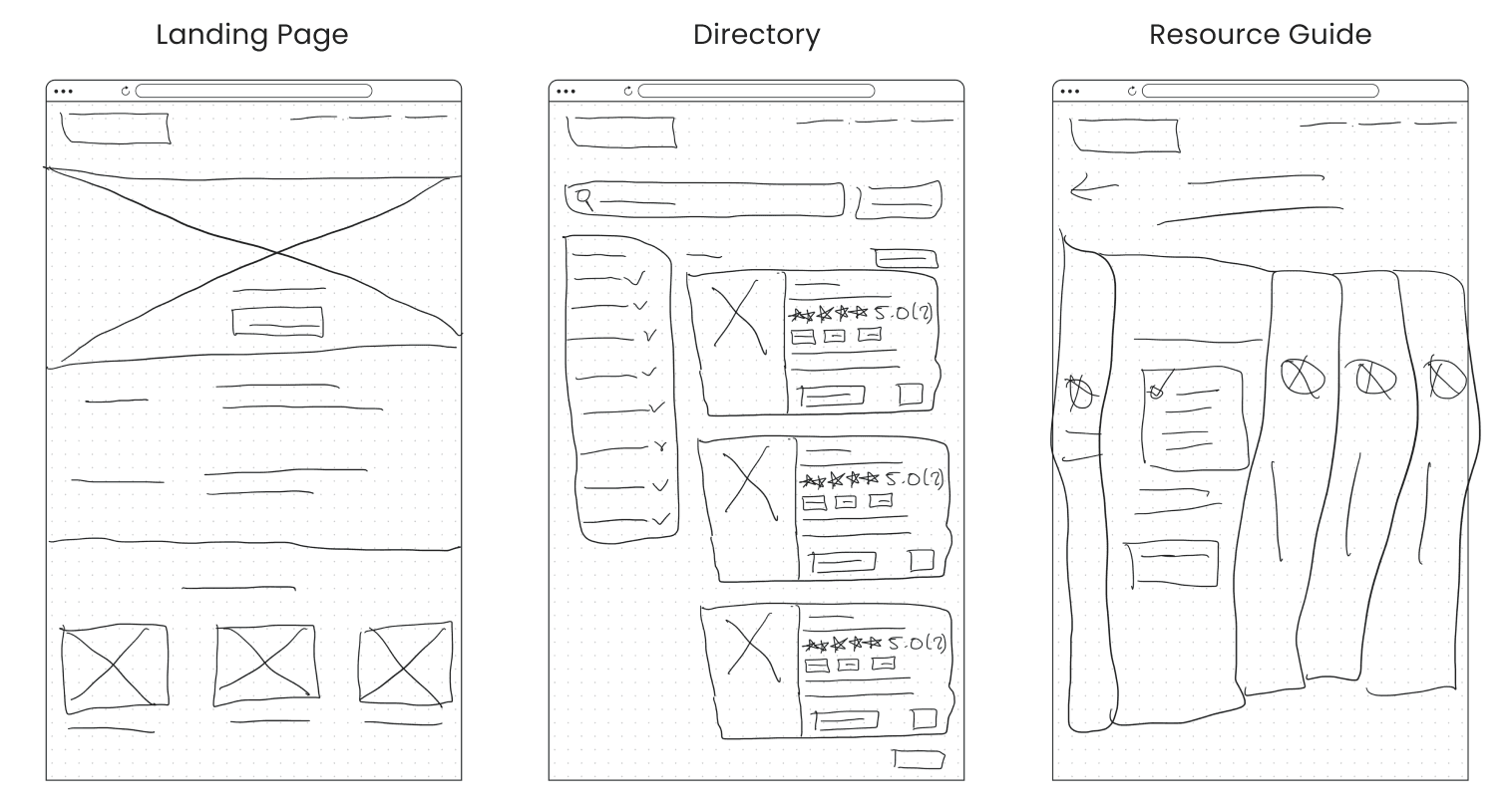
Sketches
We began with low-fidelity sketches that outlined the core functions—finding therapists, accessing resources, and connecting with other parents. Early iterations focused on simplicity and user control. For example, initial wireframes featured a simple search bar and a list of therapists, but users found the layout too generic and struggled to identify resources quickly.

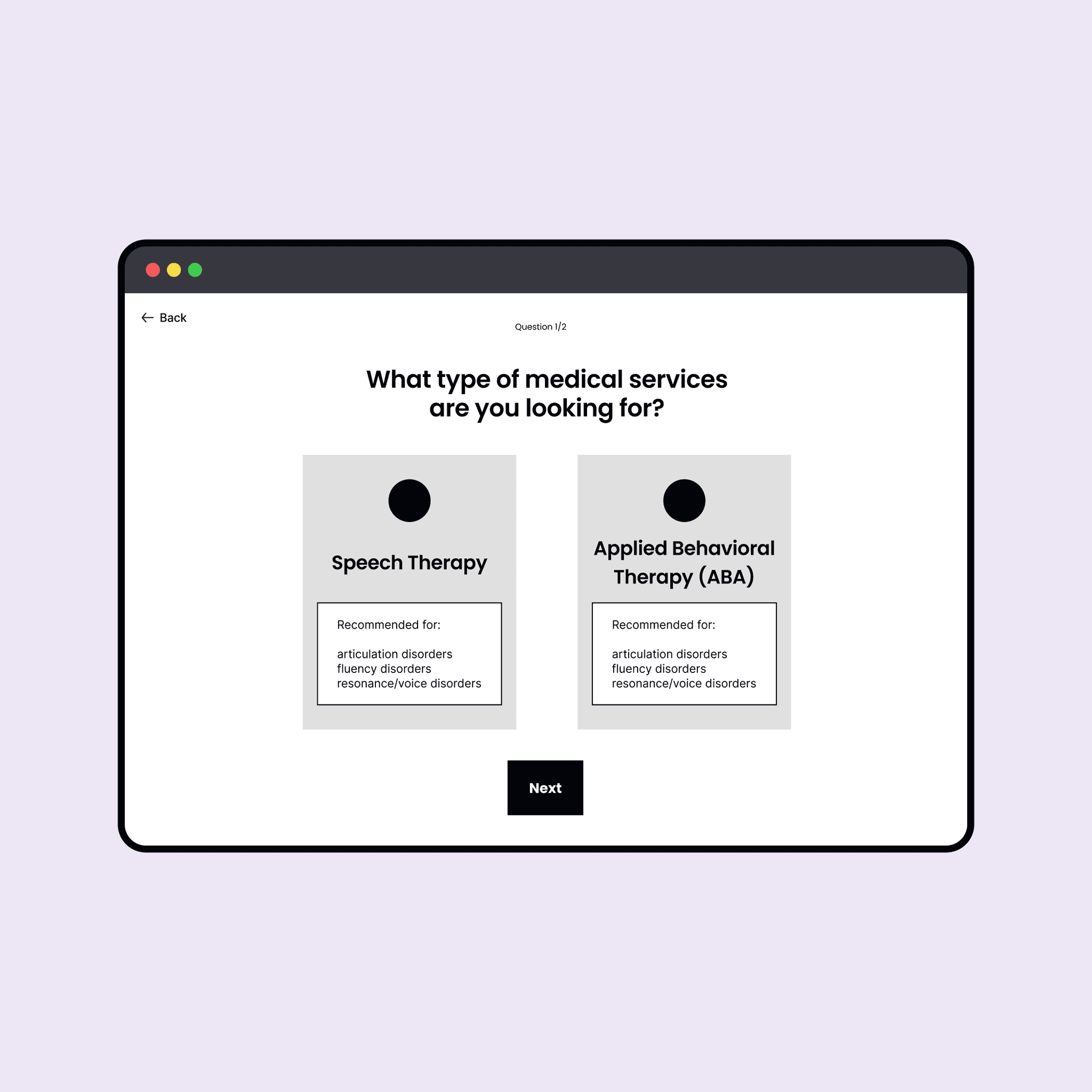
Mid-Fidelity Prototypes
Mid-fidelity prototypes brought our designs closer to reality. For instance, the therapist directory included filters for proximity, availability, and specialty, and the resource guide shifted to a vertical checklist layout.

Listening to Parents' Needs
Based on user testing conducted by our UX Research team, we noticed that users did not connect with the proposed layout and design of some of the current designs for the resources guide.
Testing these prototypes with parents revealed critical insights:

final Design
A Centralized, User-Friendly Platform Empowering Parents
By iteratively refining the design based on user insights, we were able to create a solution that felt intuitive, supportive, and approachable.
User-Friendly Resource Guide
User testing revealed that 4 out of 4 parents did not realize they needed to scroll down in the resource guide. To address this, I reduced the space above the fold to make more content visible immediately and added a clear prompt encouraging users to "scroll." These adjustments improved usability by guiding users to explore the full guide and created a more engaging and informative first impression..
Through this collaborative, user-focused process, the final design not only addresses the immediate needs of parents but also builds a platform they can trust to guide them through challenging processes with clarity and ease.
Reflection & Future Opportunities
Lessons Learned and Path Forward
This project underscored the importance of user-centered design, flexibility, and collaboration while also revealing the challenges of working within tight constraints. The limited 8-week timeline posed significant hurdles, particularly given the extensive overhaul required for the resource guide. The time pressure left little room for thorough user research, iterative testing, and refinement—all critical elements for creating a truly user-centered product. This constraint limited our ability to deeply understand and address user needs, as well as to explore creative solutions to enhance the guide’s clarity and usability.
Key takeaways include:
😊 Embracing User Feedback
🔑 Simplicity is Key
🤝 Collaboration Enhances Outcomes
Reflecting on this experience, additional time would have been valuable to refine the guide through ongoing user testing and brainstorming sessions. These lessons emphasize the need to advocate for adequate time in future projects to ensure user needs are fully addressed, designs are thoughtfully tested, and solutions are more thoroughly polished.
The Path Forward
Looking ahead, there are exciting opportunities to expand and enhance the platform:
Accessibility Enhancements: Implementing features like adjustable text sizes, screen reader compatibility, and language translation to serve a broader range of users.
Community Building: Developing a peer-to-peer support network within the platform, enabling parents to share experiences, advice, and encouragement.
Continuous Improvements to Resources: Managing disability is a continuous process, and parents long for more information on topics like respite activities, leisure activities, afterschool programs, camps, etc.
I am inspired to carry these lessons forward, continually striving to design solutions that are empathetic, inclusive, and impactful.
"The best products are born with a deep empathy with the people who use them."